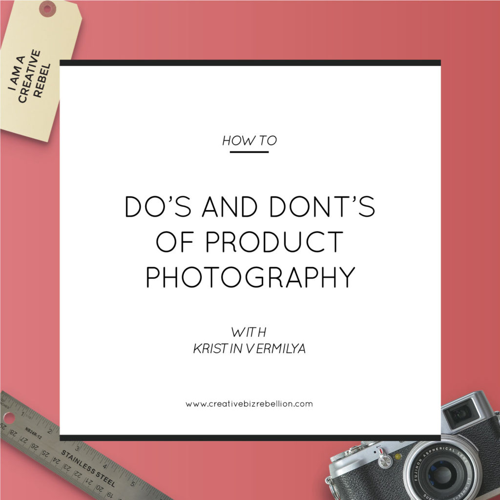

Hey there, Rebels! (I’ve always wanted to say that.) As a follow up to my interview with Kelly and Caroline on episode 38 of the podcast, I wanted to share with you my do’s and don’t for photographing your products. Let’s dive right in!
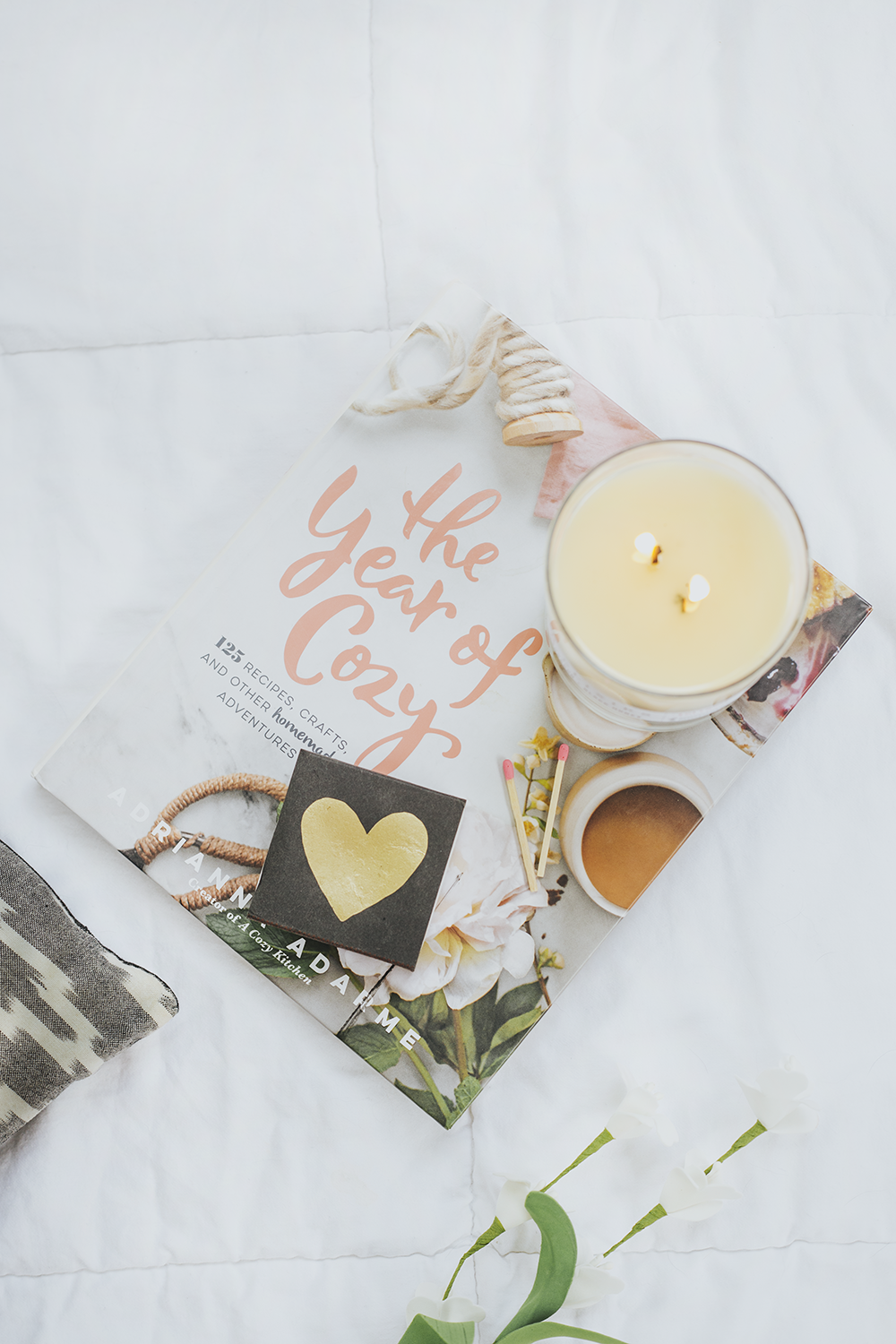
Do: Show Close-Up Shots of Details

As I mentioned in the interview, leaving out detail shots of your products can subconsciously make a potential customer wonder if you’re trying to hide those details. When it comes to styling your photos and shooting them – be sure you aren’t leaving out any of these important close-ups. I’m talking zippers, buttons, fonts, patterns, the back of your products, the hardware, the imprint, the size. All of these things need to be considered and photographed so that you are portraying the entire visual story to your customer.
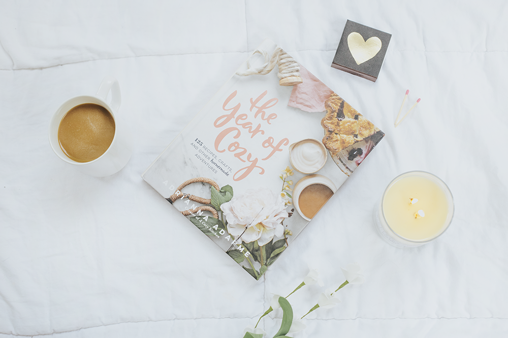
Do: Pay Attention to Clutter

Can you guess which of the two photos above is the “do” and which is the “don’t”? Trick question! They’re both don’ts. Let me explain: as part of the general composition of your photos, you want to pay close attention to how your products and props are spaced in relation to each other. The top photo shows my props very tightly clustered with little white space surrounding. You may not mind how this looks – it’s a lot up to personal preference – but I like to let the subjects of my photo breathe.The bottom photo shows a very minimal clustering of objects. With only two props – the coffee and the book – and a lot of white space, it can look too bare. Again, if you like a super minimal aesthetic, this could be fine. But personally, I think this needs something more (though the texture of the quilted duvet helps).
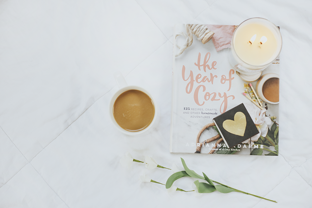
Do: Be Aware of Your Main Subject or Focal Point
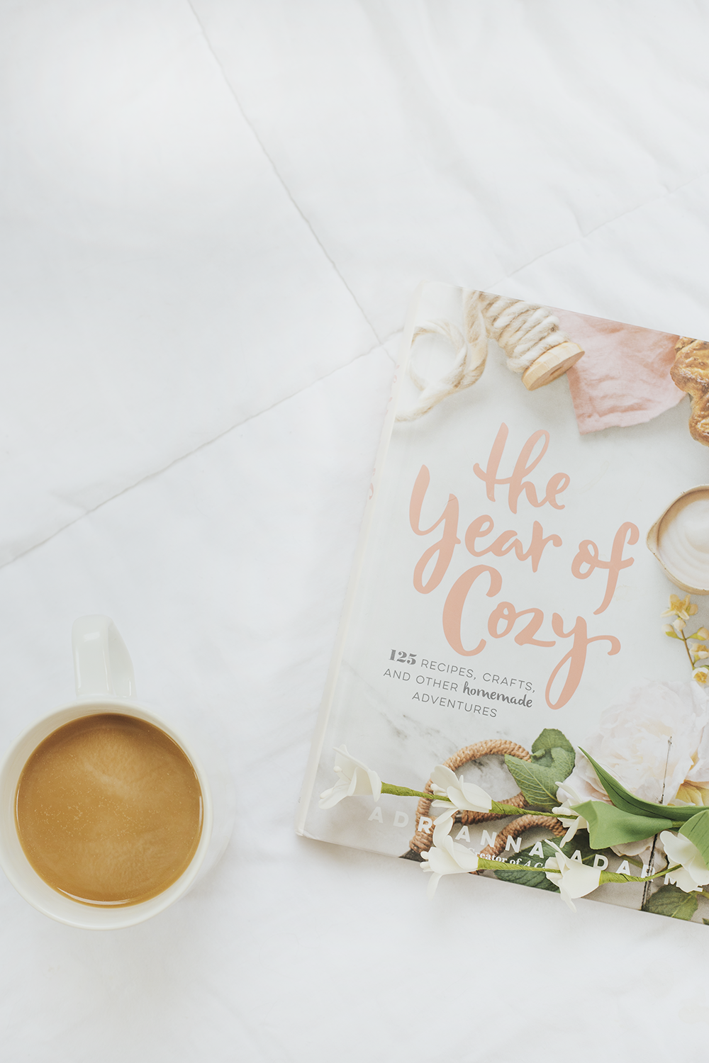
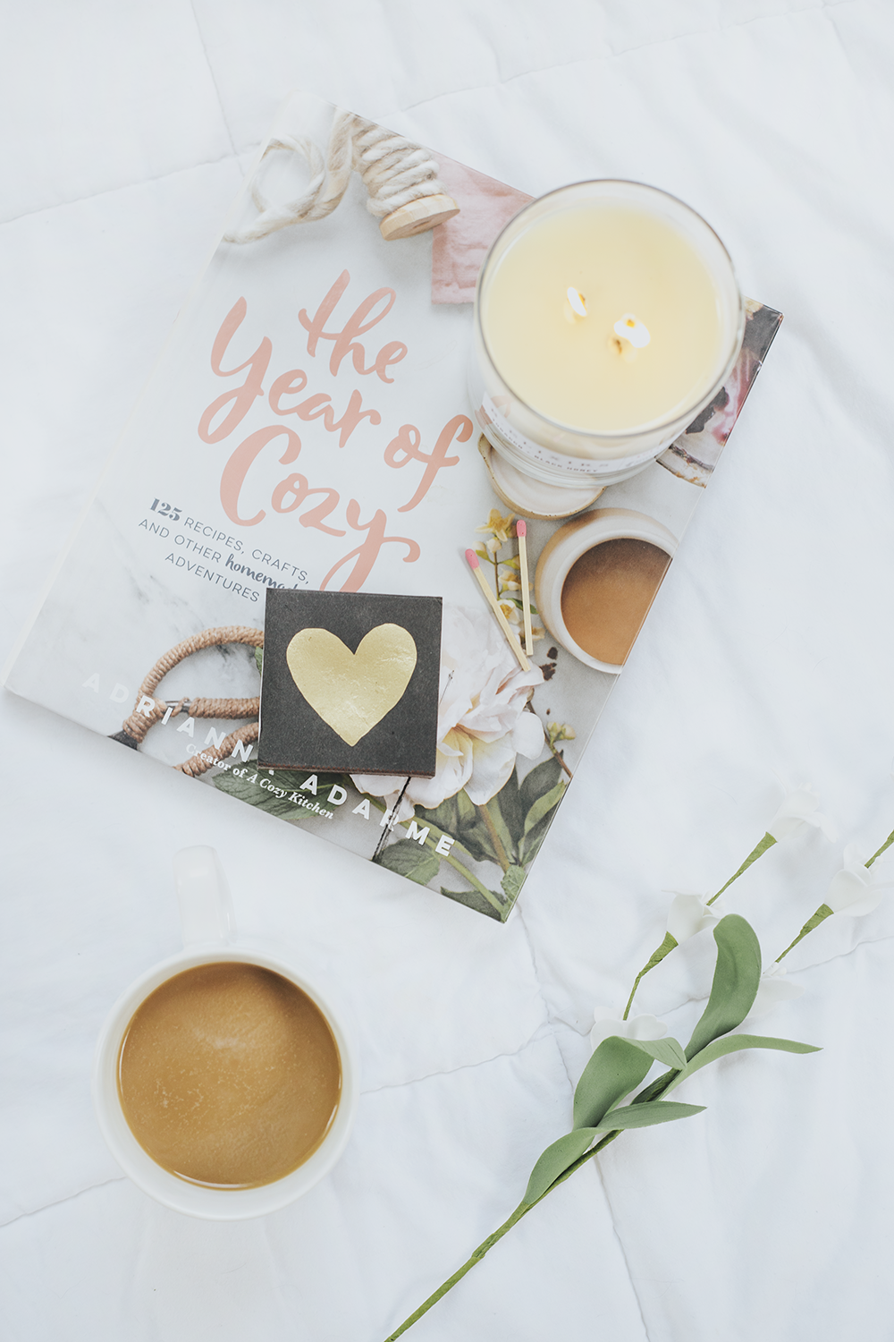
This is a very important tip to keep in mind, especially for product photography. You always want your product to be the focal point! In the top photo, the focal point, or subject, is the cup of coffee. The surrounding props – the book, the matches, the flowers – don’t distract from the subject, but they add texture, context and color.
The way the props are arranged in the top photo, the eye is naturally drawn to the coffee (see how the flowers point to it, literally leading your eye there?). The way the props are arranged in the bottom photo, there is no clear subject and none of the props lead your eye towards anything specific. The coffee is supposed to be the subject, right? So why is it on the edge of the frame? This photo makes it look like the book is the main subject – which it shouldn’t be. Also, you can only see the end of the fake flower, and it’s typically not a good idea to show your props are fake.
To keep your subject as the main focus, keep it clearly within the frame of the photo and allow the surrounding props to point towards it, rather than draw the eye away. Use the rule of thirds to help with this!
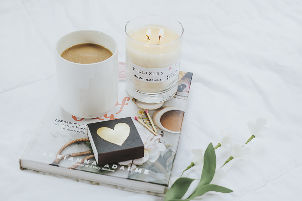
Do: Keep in Mind the Visual Weight of Objects

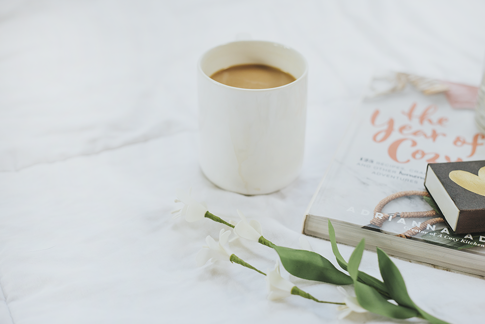
Visual weight is a tricky thing and it has nothing to do with the actual weight of the objects in the photo (usually)! In the bottom photo, the dark pillow takes up a whole corner of the frame and draws a considerable amount of attention. It’s the first thing my eye goes to, instead of the little vignette (or cluster of images) in the center.
If an object is much darker than the majority of the other objects in your photo, it will naturally draw the eye towards it. Dark draws more attention (and feels visually heavier) surrounded by light objects and vice versa. In order to counter this, I only placed a small amount of the pillow in the top photo, at the edge of the frame, and it points straight to the book vignette.
Do: Watch Your Spacing
I’m constantly surprised by how different photos appear in front of my eyes from how they appear on my camera screen. Without fail, I’ll think that I have props placed close enough together and then I’ll review the photo and they’ll look miles apart. So this is definitely something that you have to adjust as you go.
The top photo shows all of my props displayed uncomfortably far apart from each other. The size of the book and the center position of it would give the impression that it’s the subject of the photo, but then what are all of those props doing? What purpose are they serving? It’s impossible to tell when they have no physical proximity to each other.
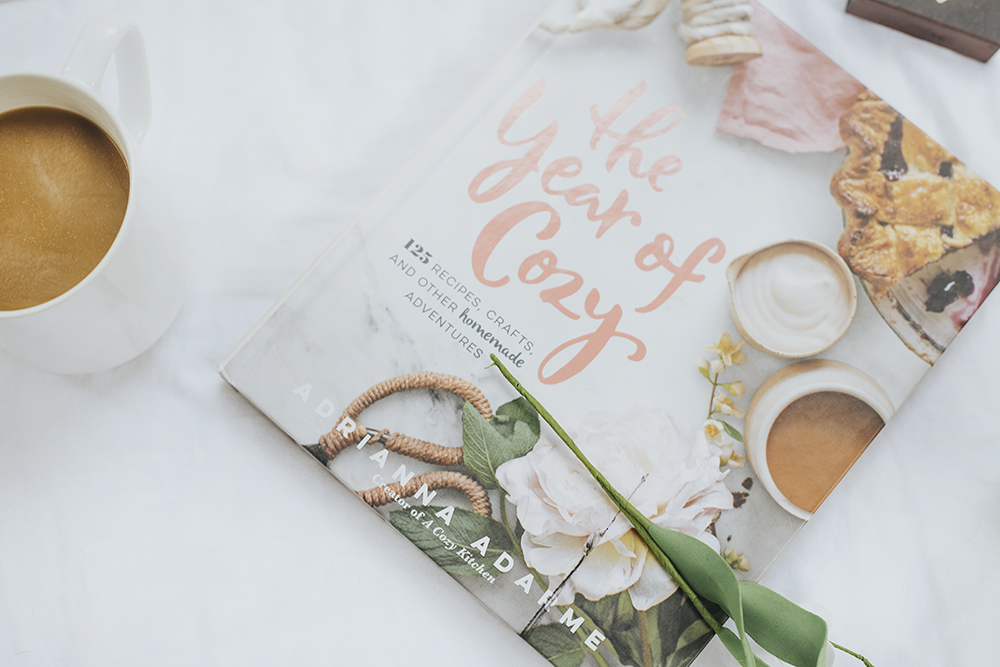
The bottom photo handles spacing better: the matchbox and candle are close together, which makes more sense given that’s what matchboxes are for. The weight of the photo is clustered around the right side with plenty of white space on the left side to balance it. Your eye knows where to focus and the props make sense in context.
Do: Play with Height Variation
This whole post has been basically about how to draw the eye to your photo’s subject, and this is no different. Playing with the height of objects can create a sense of depth within your photo, which keeps the eye going.
In the top photo, you can see the coffee mug and candle are both on the book, making them about the same height. While you do have some height variation with the flowers, book and then coffee and candle, the two tallest objects are right next to each other – so the eye is drawn there and stops. The coffee mug and candle being the same height (and both on top of the book) can feel awkward. First of all, the context doesn’t make sense. Why would a mug of coffee be right next to a candle, and why would both of those things be on top of a book at the same time? One or the other, but not both.
In the bottom photo, the height variation is more balanced and clear. With the coffee mug and candle on different planes, there’s no visual competition between them. Your eye can start at the bottom of the photo and be drawn upward. That feeling of the photo going on and on – that’s depth.
Whew – that was a lot! The most important thing to remember about photo styling is that it takes practice and persistence to figure out what you like and don’t like. Keep with it! If you’d like to see a list of my favorite styling props – check out my styling guide here!
Kristin Vermilya is an editorial photographer and – when not listening to true crime podcasts – educates bloggers and creative biz owners on how to build a stronger brand by conquering their photography fears. She takes the “DIY Hard” approach to life – messy and imperfect with the determination of Bruce Willis chasing down Hans Gruber.
WHERE TO FIND HER